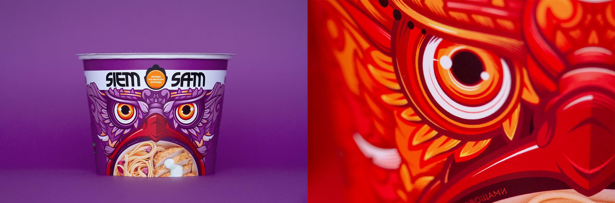
SIEM SAM

Client
SIEM SAM
Services
Branding
Packaging
AWARDS
Images generated with AI
CASE STUDY
To ensure that the positioning was based in reality, we worked closely with the client to prepare recommendations for the product’s formulation and composition: from the fineness of the flour to the width of the noodles to the broth itself. In the end, our R&D people had to give serious thought about how to follow all our recommendations.
Naming
We gave ourselves an impossible task: come up with a name that would scream out our positioning from the shelf while embodying the essence of the product. We developed at least a dozen suitable names, but in our hearts we knew there was only one thing that could truly fulfill our demands.
Siem Sam is phonetically Asian and, in Slavic languages, it suggests that someone is greedily hungry. Later we realized how successful the name was, as it speaks not only about the size of the portion, but also hints at the taste of the dish itself, since it leaves no desire to share.